class: center, middle, inverse, title-slide # Unidad 1.3 <br/>Representación gráfica ## Módulo 1 ### ### Daniel Enrique González Gómez <br/> Universidad Javeriana Cali ### 2021-08-06 --- class: inverse <br/><br/><br/> # AGENDA <br/> ## 1. Presentación guía de aprendizaje 1.3 ## 2. Varios --- ## Introducción Una gráfica o una representación gráfica o un gráfico, es un tipo de representación de datos, generalmente cuantitativos, mediante recursos visuales (líneas, vectores, superficies o símbolos), para que se manifieste visualmente la relación matemática o correlación estadística que guardan entre sí. Wikipedia ## Paquetes de R para realizar graficos <img src="img/RStudio.jpeg" width="210"> <img src="img/ggplot2.png" width="200"> <img src="img/highcharter.png" width="200"> <img src="img/shiny.png" width="200"> <img src="img/plotly.png" width="200"> --- ### Gráficos variables cualitativas con R base [//]: <> (---------------------------------------------------------------------) .panelset[ .panel[.panel-name[Grafico de tortas] ```r cc=c(20, 10, 20, 20, 20, 20, 20, 20, 20, 30, 20, 20, 20, 10, 30, 20, 20, 30, 20, 30, 30, 20, 10, 30, 20, 20, 30, 30, 10, 20, 10, 20, 20, 20, 10, 20, 10, 20, 20, 30, 30, 30, 10, 30, 20, 20, 20, 20, 20, 20, 10, 20, 30, 30, 10, 10, 10, 20, 10, 20, 10, 30, 20, 10, 20, 30, 10, 30, 30, 30, 20, 30, 30, 30, 30, 30, 30, 20, 10, 30, 10, 20, 20, 10, 20, 20, 20, 20, 10, 20) labs=c("Ing. Mecánica","Ing. Civil ","Ing.Sistemas") pct=round(table(cc)/sum(table(cc))*100) labs=paste(labs, pct);labs=paste(labs, "%", sep = " ") t1=table(cc) pie(t1, labels=labs, main=" Distribución por carrera") ``` 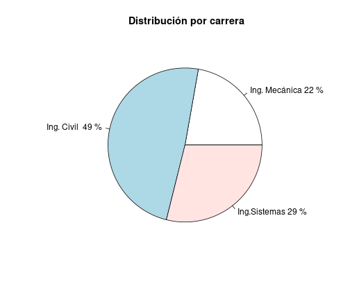<!-- --> ] [//]: <> (---------------------------------------------------------------------) .panel[.panel-name[Diagrama de barras] ```r ev=table(rbinom(90,5,0.80)); barplot(ev, col=c("red","yellow","orange","green","blue"), main = "Evaluación proceso de inducción") ``` 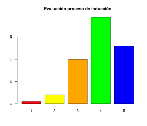<!-- --> ] .panel[.panel-name[Diag. de barras dos variables] ```r counts <- table(mtcars$vs, mtcars$gear); rownames(counts)=c("Montor en linea", "Motor en V") barplot(counts, main="Número de cambios adelante por Tipo de motor", xlab="Número de cambios adelante ",col=c("dodgerblue3","orange"), legend = rownames(counts)) ``` 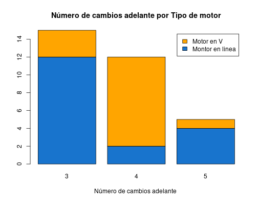<!-- --> ] ] [//]: <> (---------------------------------------------------------------------) --- ### Graficas variables cuantitativas con R base .panelset[ .panel[.panel-name[Diag.de arbol] ```r nf=c(4.1, 2.7, 3.1, 3.2, 3.0, 3.2, 2.0, 2.4, 1.6, 3.2, 3.1, 2.6, 2.0, 2.4, 2.8, 3.3, 4.0, 3.4, 3.0, 3.1, 2.7, 2.7, 3.0, 3.8, 3.2, 2.2, 3.5, 3.5, 3.8, 3.5, 3.9, 4.2, 4.3, 3.9, 3.2, 3.5, 3.5, 3.7, 4.1, 3.7, 3.5, 3.6, 3.2, 3.1, 3.4, 3.0, 3.0, 3.0, 2.7, 1.7, 3.6, 2.1, 2.4, 3.0, 3.1, 2.5, 2.5, 3.6, 2.2, 2.4, 3.1, 3.3, 2.7, 3.7, 3.0, 2.7, 3.0, 3.2, 3.1, 2.4, 3.0, 2.7, 2.5, 3.0, 3.0, 3.0, 3.2, 3.1, 3.8, 4.1, 3.7, 3.5, 3.0, 3.7, 3.7, 4.1, 3.7, 3.9, 3.7, 2.0) stem(nf) ``` ``` ## ## The decimal point is at the | ## ## 1 | 67 ## 2 | 00012244444 ## 2 | 555677777778 ## 3 | 0000000000000011111111222222223344 ## 3 | 555555566677777777888999 ## 4 | 0111123 ``` ] .panel[.panel-name[Histograma] ```r h1=hist(nf, main = "Nota final matemáticas fundamentales", xlab = "nota", ylab="frecuencias absolutas", labels=TRUE, col="dodgerblue3", ylim = c(0,30)) abline(v=3,col="red") grid() ``` 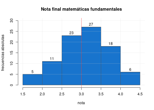<!-- --> ] .panel[.panel-name[Diag.de Densidad] ```r nf=c(4.1, 2.7, 3.1, 3.2, 3.0, 3.2, 2.0, 2.4, 1.6, 3.2, 3.1, 2.6, 2.0, 2.4, 2.8, 3.3, 4.0, 3.4, 3.0, 3.1, 2.7, 2.7, 3.0, 3.8, 3.2, 2.2, 3.5, 3.5, 3.8, 3.5, 3.9, 4.2, 4.3, 3.9, 3.2, 3.5, 3.5, 3.7, 4.1, 3.7, 3.5, 3.6, 3.2, 3.1, 3.4, 3.0, 3.0, 3.0, 2.7, 1.7, 3.6, 2.1, 2.4, 3.0, 3.1, 2.5, 2.5, 3.6, 2.2, 2.4, 3.1, 3.3, 2.7, 3.7, 3.0, 2.7, 3.0, 3.2, 3.1, 2.4, 3.0, 2.7, 2.5, 3.0, 3.0, 3.0, 3.2, 3.1, 3.8, 4.1, 3.7, 3.5, 3.0, 3.7, 3.7, 4.1, 3.7, 3.9, 3.7, 2.0) plot(density(nf), main="Distribución de las notas de matemátias fundamentales", col="dodgerblue3", lwd=5 ) ``` 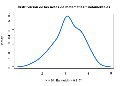<!-- --> ] .panel[.panel-name[Diag.de Cajas] ```r nf=c(4.1, 2.7, 3.1, 3.2, 3.0, 3.2, 2.0, 2.4, 1.6, 3.2, 3.1, 2.6, 2.0, 2.4, 2.8, 3.3, 4.0, 3.4, 3.0, 3.1, 2.7, 2.7, 3.0, 3.8, 3.2, 2.2, 3.5, 3.5, 3.8, 3.5, 3.9, 4.2, 4.3, 3.9, 3.2, 3.5, 3.5, 3.7, 4.1, 3.7, 3.5, 3.6, 3.2, 3.1, 3.4, 3.0, 3.0, 3.0, 2.7, 1.7, 3.6, 2.1, 2.4, 3.0, 3.1, 2.5, 2.5, 3.6, 2.2, 2.4, 3.1, 3.3, 2.7, 3.7, 3.0, 2.7, 3.0, 3.2, 3.1, 2.4, 3.0, 2.7, 2.5, 3.0, 3.0, 3.0, 3.2, 3.1, 3.8, 4.1, 3.7, 3.5, 3.0, 3.7, 3.7, 4.1, 3.7, 3.9, 3.7, 2.0) boxplot(nf, main="Nota final matemáticas fundamentales",col="dodgerblue3") abline(h=3, col="red") ``` 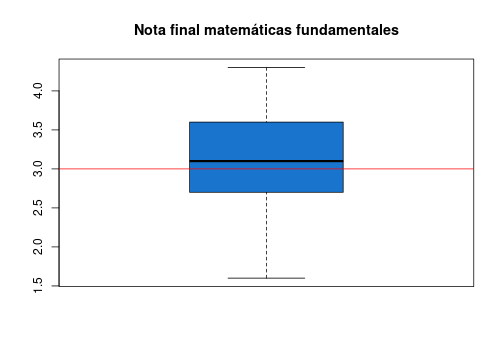<!-- --> ] .panel[.panel-name[Diag.de cajas~factor] ```r nf=c(4.1, 2.7, 3.1, 3.2, 3.0, 3.2, 2.0, 2.4, 1.6, 3.2, 3.1, 2.6, 2.0, 2.4, 2.8, 3.3, 4.0, 3.4, 3.0, 3.1, 2.7, 2.7, 3.0, 3.8, 3.2, 2.2, 3.5, 3.5, 3.8, 3.5, 3.9, 4.2, 4.3, 3.9, 3.2, 3.5, 3.5, 3.7, 4.1, 3.7, 3.5, 3.6, 3.2, 3.1, 3.4, 3.0, 3.0, 3.0, 2.7, 1.7, 3.6, 2.1, 2.4, 3.0, 3.1, 2.5, 2.5, 3.6, 2.2, 2.4, 3.1, 3.3, 2.7, 3.7, 3.0, 2.7, 3.0, 3.2, 3.1, 2.4, 3.0, 2.7, 2.5, 3.0, 3.0, 3.0, 3.2, 3.1, 3.8, 4.1, 3.7, 3.5, 3.0, 3.7, 3.7, 4.1, 3.7, 3.9, 3.7, 2.0) cc=c(20, 10, 20, 20, 20, 20, 20, 20, 20, 30, 20, 20, 20, 10, 30, 20, 20, 30, 20, 30, 30, 20, 10, 30, 20, 20, 30, 30, 10, 20, 10, 20, 20, 20, 10, 20, 10, 20, 20, 30, 30, 30, 10, 30, 20, 20, 20, 20, 20, 20, 10, 20, 30, 30, 10, 10, 10, 20, 10, 20, 10, 30, 20, 10, 20, 30, 10, 30, 30, 30, 20, 30, 30, 30, 30, 30, 30, 20, 10, 30, 10, 20, 20, 10, 20, 20, 20, 20, 10, 20) labs=c("Ing. Industrial","Administración ","Contaduría ") boxplot((nf~cc),main="Nota final matemáticas fundamentales por carrera", col="dodgerblue3"); abline(h=3, col="red"); abline(h=4, col="blue") ``` 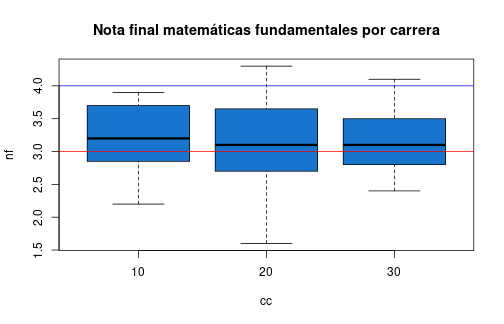<!-- --> ] .panel[.panel-name[Diag.de Dispersiòn] ```r ed=round(rnorm(90,18,1),1) plot(ed,nf, main="Edad vs Nota final matemáticas fundamentales", ylim = c(0,5), xlab = "Edad", ylab = "Nota final",col="dodgerblue3",pch=19, las=1) grid() ``` 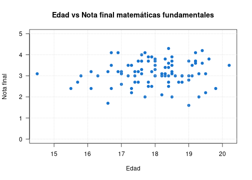<!-- --> ] .panel[.panel-name[Series de tiempo] ```r plot(AirPassengers, main="Número de pasajeros por mes", col="dodgerblue3", lwd = 2) ``` 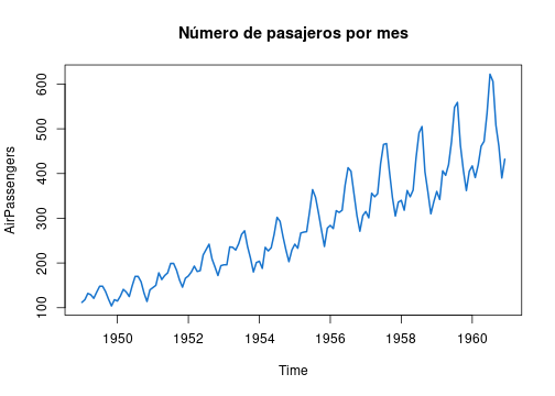<!-- --> ] .panel[.panel-name[Resumen] ```r x=rnorm(100,100,20) y=rnorm(100,100,25) z=rbinom(100,4,0.30) t=1:100 par(mfrow=c(1, 5)) pie(table(z)) barplot(table(z)) stem(x) hist(x) boxplot(x) plot(x,y) plot(t,y, type="l") plot(density(x)) ``` ] ] --- [//]: <> (---------------------------------------------------------------------) ### Gráficos con **ggplot2** .pull-left[ + **Data**: capa de los datos + **Aesthetics**: capa estetica (**aes**), definimos las variables a utilizar en el gráfico + **Geometries**: capa de geometrias, se define el tipo de gráfica a realizar + **Facets**: capa de facetas, permite detallar la gráfica por categorias + **Statistics**: capa de estadística, permite agregar modelos + **Coordinates**: capa de coordenadas, permite ajustar las escalas de los ejes + **Theme**: capas de características del gráfico que no dependen de los datos ] .pull-right[ 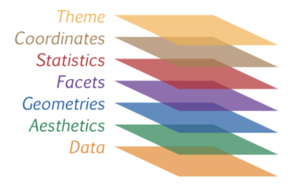 ] **Gramática de los gráficos** --- .pull-left[ [Visualización de datos con ggplot2](https://rstudio.com/wp-content/uploads/2015/03/ggplot2-cheatsheet.pdf) ```r library(readr) library(ggplot2) clasificacion=read.csv("data/futbol.csv") ggplot(clasificacion, aes(x=off , y=def)) ``` 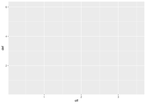<!-- --> ] .pull-right[  ] --- .pull-left[ ```r ggplot(clasificacion, aes(x=off , y=def))+ geom_point() ``` 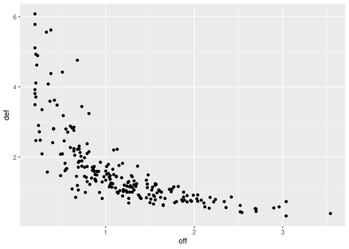<!-- --> ] .pull-right[  ] --- .pull-left[ ```r ggplot(clasificacion, aes(x=off , y=def))+ geom_point() ``` <!-- --> ] .pull-right[  + geo_point() + geom_bar() geom_col() stat_count() + geom_boxplot() stat_boxplot() + geom_density() stat_density() + geom_histogram() + geom_violin() + ... ] --- .pull-left[ ```r ggplot(clasificacion, aes(x=off , y=def))+ geom_point()+ facet_wrap(~ confed) ``` 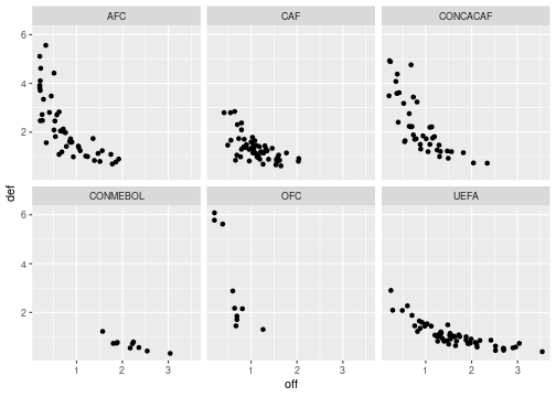<!-- --> ] .pull-right[  ] --- .pull-left[ ```r ggplot(clasificacion, aes(x=off , y=def))+ geom_point()+ facet_wrap(~ confed)+ stat_smooth(method = "loess" , formula =y ~ x) ``` 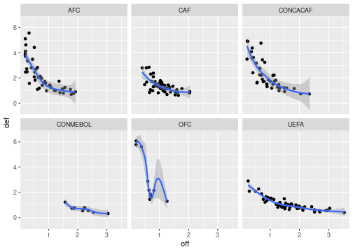<!-- --> ] .pull-right[  ] --- .pull-left[  ] .pull-right[ ```r ggplot(clasificacion, aes(x=off , y=def))+ geom_point()+ facet_wrap(~ confed)+ stat_smooth(method = "loess" , formula =y ~ x)+ coord_cartesian(ylim = c(0, 10)) ``` 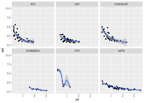<!-- --> ] --- ```r library(ggplot2) data=data.frame(grupo=c("A","B","E"),frecuencia=c(26,35,19)) ggplot(data, aes(x=grupo, y=frecuencia)) + geom_bar(stat="identity", fill="steelblue")+ geom_text(aes(label=grupo), vjust=1.6, color="white", size=3.5)+ theme_minimal() ``` 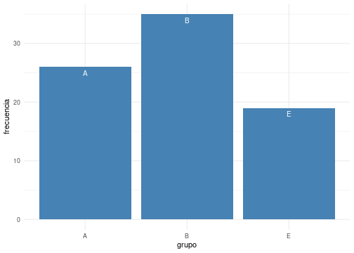<!-- --> --- ```r library(ggplot2) ggplot(mtcars, aes(x=mpg, y=wt, colour = cyl)) + geom_point() ``` 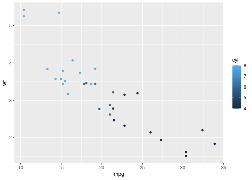<!-- --> --- ```r data("iris") ggplot(iris, aes(Sepal.Length)) + geom_histogram(bins = 7,fill="#69b3a2", color="#e9ecef", alpha=0.9)+ theme_minimal() + labs(x = "Nota", y = "n") + ggtitle(" Promedio acumulado estudiantes de PyE 2021-1") ``` 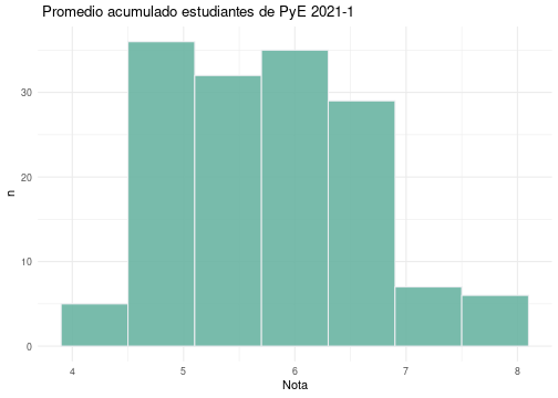<!-- --> --- ```r library(ggplot2) ventas = read.csv("data/ventas.csv") ggplot(ventas, aes(x=Edad, y=Tipo_Cliente)) + geom_boxplot(fill="#313ae8", # color de relleno color="#bf6f2e", # color de lineas alpha=0.5)+ geom_point(color="#b431e8",alpha=0.9) ``` 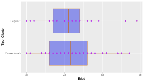<!-- --> ```r # Colour picker ``` [Análisis de datos con R Cap,7 ggplot2](https://rafalab.github.io/dslibro/ggplot2.html)<br/> [ggplot2 resumen](https://rstudio.com/wp-content/uploads/2015/03/ggplot2-cheatsheet.pdf) --- ## Gráficos con highcharter <img src="img/highcharter.png" width="300"> https://jkunst.com/highcharter/ https://rstudio-pubs-static.s3.amazonaws.com/320413_6ab300527e8548b1a3cbd0d4c6200fcc.html --- ## Gráficos con plotly <img src="img/plotly.png" width="300"> https://plotly.com/r/ https://plotly-r.com/ --- ## Gráficos con Shiny <img src="img/shiny.png" width="300"> + [Genoma humano](https://shiny.rstudio.com/gallery/genome-browser.html) + [Paquetes de R](https://gallery.shinyapps.io/087-crandash/) + [Galeria](https://shiny.rstudio.com/gallery/) --- ### RMarkdown <img src="img/hex-rmarkdown.png" width="300"> [RMarkdown resumen](https://rstudio.com/wp-content/uploads/2015/02/rmarkdown-cheatsheet.pdf)<br/> [R flexdashboard - ejemplo](https://rpubs.com/joscani/flexdashboard_examples)<br/> [R flexdashboard - implementaciòn](https://geoprocesamiento-2020i.github.io/tutorial-flexdashboard/) --- class: inverse, center background-image: url("img/pujcali.jpeg") <br/><br/><br/><br/><br/><br/><br/><br/><br/><br/><br/><br/><br/><br/><br/><br/><br/><br/> ### <p style="color:yellow"> Una imagen dice mas que mil palabras... </p> ##### <p style="color:yellow"> Daniel Enrique González Gómez </p> Imagen tomada de :https://javerianacali.edu.co/noticias/la-javeriana-bogota-y-cali-1-de-colombia